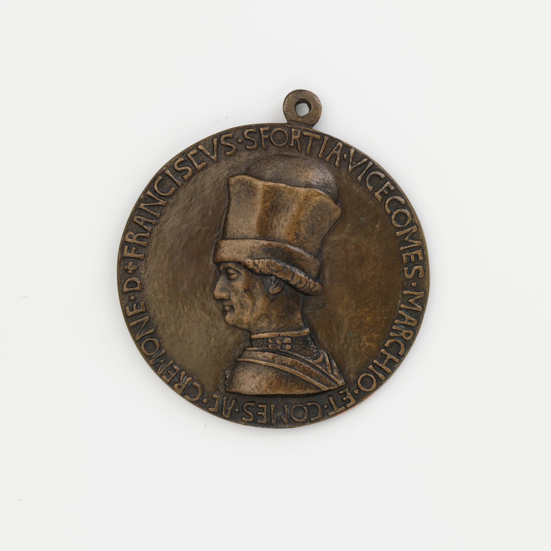
A coin asks a sculptor or an engraver to solve a problem almost no other art form imposes: compress a portrait, an emblem, a date and often a short inscription onto a disc a few centimeters across, in relief shallow enough to survive being struck by a steel die under enormous pressure and then carried in a pocket for decades. Numismatists who take design seriously read a coin the way a critic reads a sculpture or a struck medal, not the way a shopper reads a price tag: composition, modeling, the handling of negative space, and how well the design survives the physical process of being turned into metal at all.
Relief as the Central Technical Problem
Relief sculpture sits between two extremes, a flat image on one side and a fully round freestanding figure on the other, and a coin sits at the most compressed end of that range. The highest points of a well-designed coin rarely rise more than a fraction of a millimeter above the field, yet a skilled engraver can still suggest a full head turned in three-quarter profile, the folds of drapery, or the musculature of an animal within that shallow space. Getting this right requires understanding how light will catch the design once it is struck and handled, something a sculptor working in low relief for architecture or a plaque has to master as well, which is exactly why coin design has historically drawn talent trained in exactly that discipline rather than treating coinage as a separate, lesser craft.
The physical demands of striking limit what a design can attempt in ways a painter or even a sculptor working in the round never has to consider. A design with edges too sharp or relief too high will not strike up cleanly, will wear down quickly once the coin circulates, or will cause dies to crack under repeated pressure. Working within that constraint while still producing a design with real artistic ambition is the specific skill this section treats seriously: a coin that looks effortless in hand is usually the product of an engraver solving a genuinely hard problem in a genuinely small space.
Portraiture at Miniature Scale
Coin portraiture has its own history and its own conventions, distinct from painted or sculpted portraiture even where the two influence each other directly. The profile portrait is the default orientation on the overwhelming majority of coins across history, and it exists because a profile reads clearly in low relief in a way a three-quarter or frontal view generally does not; the sharp line of a jaw or a brow catches light and shadow legibly at a scale where a frontal face would collapse into a blur of shallow bumps. Within that constraint, engravers still find room for genuine individual style: compare a Renaissance medal's crisp linear precision against the softer, more painterly modeling that some twentieth-century American coin designs favor, and the difference is a difference of artistic sensibility, not just of era or technique.
Allegorical and symbolic figures carry an even heavier design burden than portraiture, because they have to communicate an abstract idea through a single static figure with no supporting text doing the explanatory work, whether that idea is liberty, victory, agriculture, or a nation itself. A well-known example is the walking Liberty design used on United States half dollars in the early twentieth century, a full standing figure in motion, wrapped drapery streaming behind her, rendered successfully enough in low relief that the design is still widely reproduced today on bullion coinage decades after the original series ended, a strong sign that the underlying artistic solution is what keeps it in circulation as a favored motif, and not merely nostalgia.
Narrative Compressed Into a Reverse Design
Reverse designs frequently attempt something closer to narrative than portraiture ever does: an eagle in a specific pose, a building rendered in enough architectural detail to be recognizable, or a scene meant to commemorate a specific historical event within the space of a single small image. Commemorative coinage is where this ambition shows most clearly, since a commemorative issue exists specifically to mark something such as an anniversary, a building, or a historical figure, and its designer has to find a single visual moment that stands in for the whole event without any caption beyond a short legend around the rim. The best of these designs manage genuine storytelling in an image smaller than a postage stamp, which is a harder compositional problem than it sounds.
Judging a Coin's Design the Way a Sculpture Gets Judged
Serious numismatic writing about design tends to use the same vocabulary a sculpture critic would use: composition, balance between the design and the surrounding field, the confidence of the modeling, and whether the design actually improves once struck in metal or merely survives the process intact. This is a different axis of judgment than rarity or grade, and the two are genuinely independent of each other. A coin can be common, inexpensive and still an exceptional piece of design, and a coin can be rare and expensive while carrying design that numismatists consider mediocre. Collectors who focus only on rarity miss this distinction entirely, and collectors who focus only on design miss the historical and market context that the rest of this section covers. Both readings are legitimate and neither one replaces the other.
Attribution matters here in a way that parallels other collecting fields directly. Many coin designs carry a small, findable credit: an engraver's initials worked discreetly into the design, sometimes on the truncation of a portrait bust and sometimes tucked beside a date. That mark functions exactly like a monogram on a print or a foundry stamp on a bronze cast, a permanent, deliberately placed record of who actually made the thing. Reading a coin's design seriously means learning to look for that mark the same way a specialist looks for a painter's signature or a sculptor's foundry stamp, and identifying an artist's signature on a painting covers that same underlying skill, applied to a medium where the mark can be added with a brush rather than struck permanently into a die.
None of this treats a coin as an investment vehicle or reduces it to the metal it happens to be struck from. The rest of this site's Coins & Currency coveragegoes further into how that design work is physically produced, how much older coinage functions as a historical record in its own right, and how collectible value and metal value pull apart in practice, but the starting point for all of it is the same one this article has argued for directly: a coin's design rewards the kind of close, deliberate looking that any other small sculpture earns.